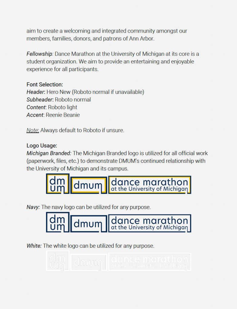
rebranding
Bioastronautics and Life Support Systems (2021)
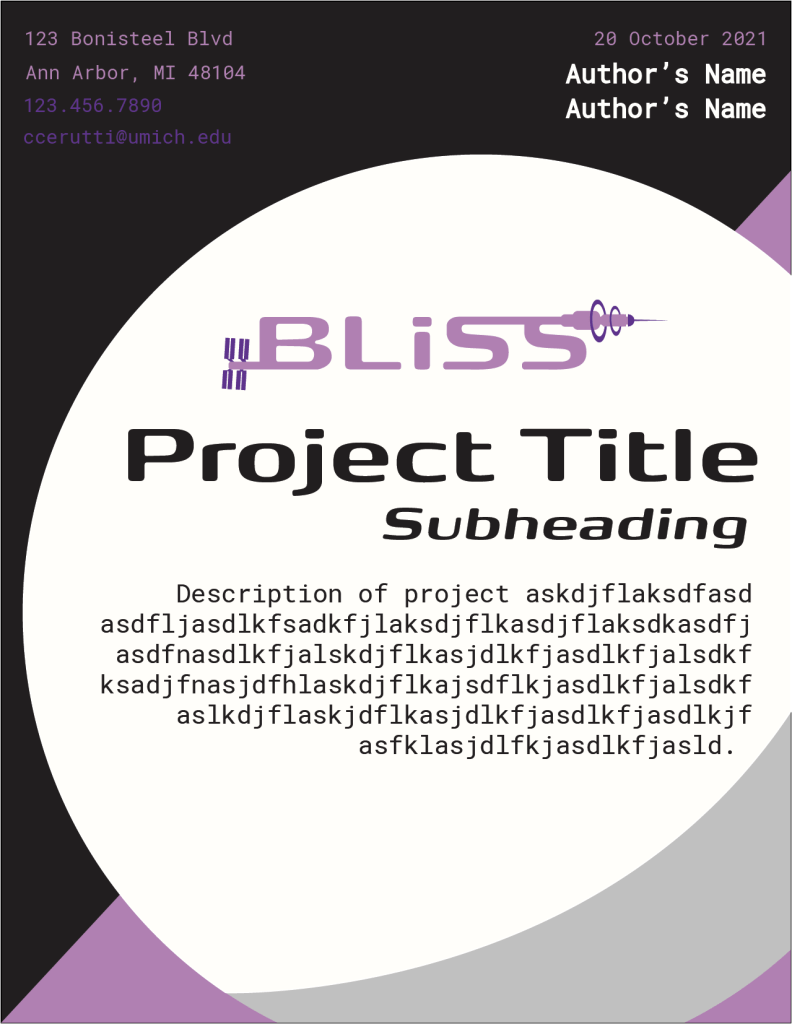
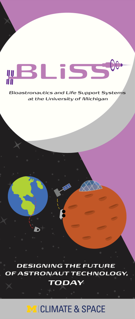
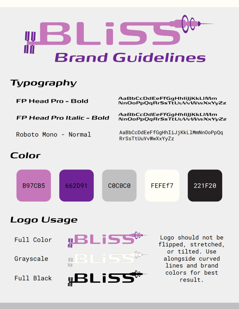
A student-run project team at the University of Michigan that collaborates with partners such as NASA and ICON, BLiSS needed a new look that embodies the present and future of space. My logo features simplistic drawings of the International Space Station and a Bernal sphere-inspired station, pulling viewers’ eyes left to right like a timeline of innovation. The letters themselves pay homage to NASA’s worm logo.
I selected a lavender and a darker purple to channel the ambition and creativity associated with the team’s work, as well as shades of gray and white for imagery of the moon. The typography is a variety of sans-serif fonts that are reminiscent of traditional sci-fi design work.

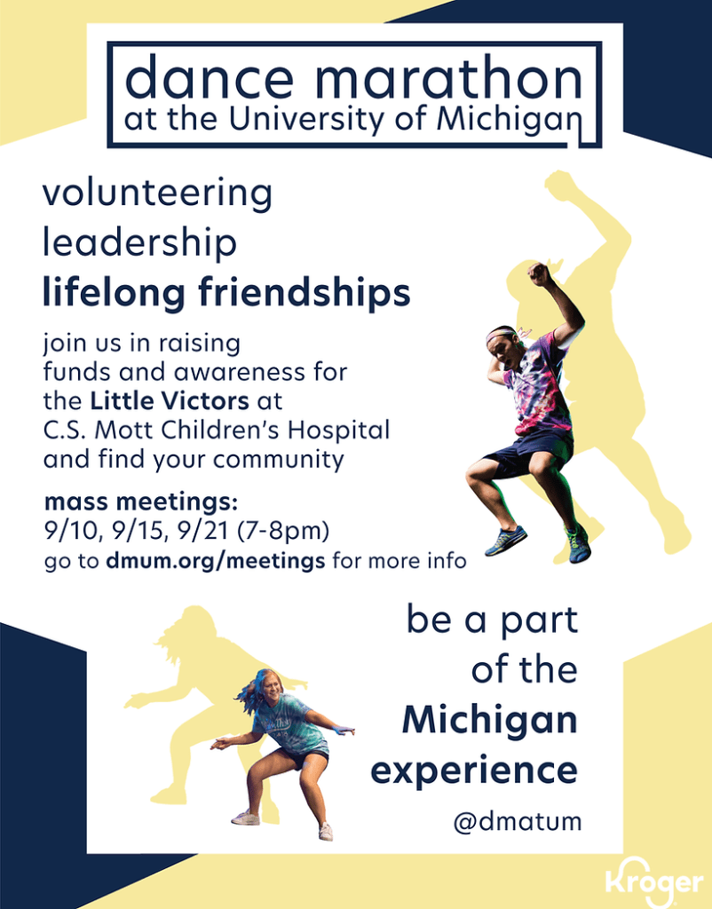
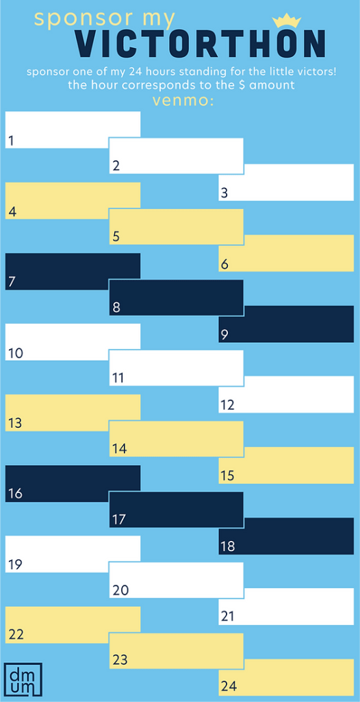
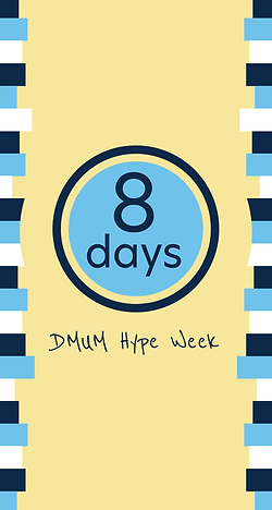
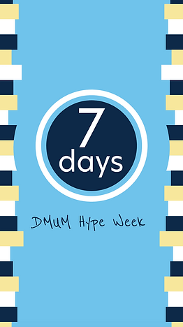
Dance Marathon at the University of Michigan (2020)
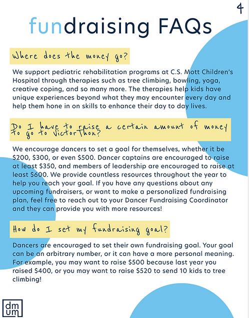
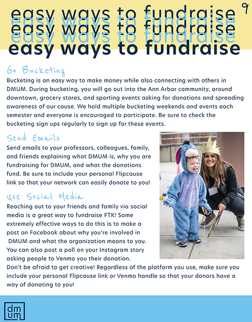
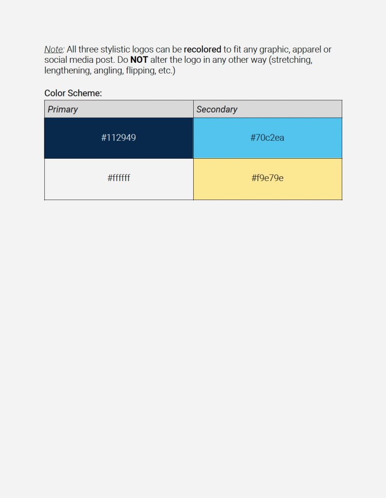
DMUM is the largest student-run nonprofit in the state of Michigan and raises funds for pediatric rehabilitation therapies. As marketing chair, I set my sights on rebranding the organization to properly channel the positive, childlike energy of the organization. I began with the logos, creating a 2 simple boxes that could be easily recolored and placed onto a variety of graphics. I selected navy and white for colors, as well as baby yellow and baby blue to act as the “children” of the University of Michigan’s classic maize and blue.
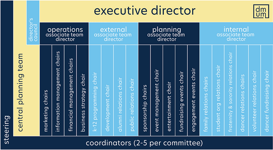
The typography is a series of rounded, sans-serif fonts that create a bouncy look. Featured below are a few samples of evergreen collateral, including an Instagram graphic from the initial unveiling of the rebrand, a recruitment poster that was featured on campus, a leadership diagram, and select pages from the 2020 sponsorship guide.